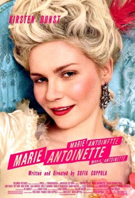
I’m highly enamored of this whole “solid blocks behind text” look.


I love how it adds strong color to the design, and makes the text relate to — but not completely integrate with — the image. It’s very tense and active. And I love how it can be bold and clean (The Robber) or hand-made and imperfect (Marie Antoinette).
It’s just good is all.