Last Thursday, I think I may have cracked the composition of my painting, Wisdom and Folly Cry Out to the Simple. It happened when I was reading along in the source material (the first 9 chapters of Proverbs), and it states that the Lady Wisdom stands at the highest place in the city and calls out, while the Woman Folly sits beside her house.
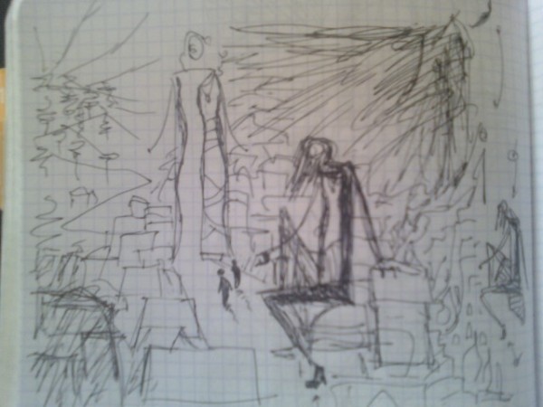
Here’s a really nasty phone camera shot of said compositional concept:

It seems to me that this takes a REALLY static picture (two similarly immense figures equally spaced, with mirror-like poses) and makes it much more dramatic, story-like, and intriguing. I’ve also changed the setting (again, based on Proverbs) from a deserted road/Romantic landscape to the middle of a town, thus giving more scale to the figures and mythology to the story. (Note: there aren’t supposed to be two “Simple” figures there… this was a pen sketch and I decided to move the little guy back away from Folly a little.)
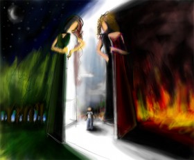
Also, this seems incredibly obvious, but I realized the the doors can open inwards. This whole time, I’ve made them swing outwards, and it’s always led to compositional issues. This appears to be a much more elegant solution to me, and it surprises me I’ve never thought of it before.
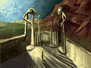
Here are two old versions. Can I get your take, people-who-read-this-blog? Am I headed in the right direction?


3 responses to “New composition for Wisdom & Folly”
Consider point of view. Why are you above the guy?
Maye you could be more on his level, looking up at the two gates. Maybe the perspective will be extreme, 3-point even.
All 3 compositions seem to have a similar distance from all the figures. Why?
Why not have some important objects go off the page. What could you be looking past, that would take a prominent foreground status?
What about some diagonals?
What about creating interesting negative space?
Connie, THANK YOU for these great crits. I so appreciate you taking the time to look at and respond to my work.
Regarding the perspective and position of the figures, my goal is to show what’s behind the gates, which is obscured from the view of the Simple figure. (Kind of like the curving river in Cole’s “Youth” painting from the Voyage of Life series.) I think, to accomplish that, I have to be above the Simple figure so that I can see what he can’t. But I’d love another solution if you have it! The distance from the figures is only for the purpose of keeping them in the scene, giving them appropriate scale, and showing what’s behind them. I don’t want to put the Simple figure too close to the “camera,” because I want him to be something of a universal everyman figure, and don’t want to add too many details.
The foreground is an area I hadn’t even considered until this latest sketch. Here, I’ve got houses from the town looming up against the foreground… these aren’t important objects, but I’d love any thoughts on how to stage this for more impact.
The strongest diagonal component is the light… but the figures are all very vertical at present. Let me look into that… maybe the houses can be set at a diagonal from the viewer…
Negative space! Forgot about that! Thank you, I definitely need to look at this from that standpoint. I’ll hopefully resubmit a sketch with some of this worked out soon.
Thank you again! Your comments are invaluable!
Wisdom should be pictured high atop her pathway, perhaps poised above seven pillars. Folly, an alluring female, easily accessible and welcoming. I think its a mistake to picture folly as decrepit and disheveled, as Satan’s emissaries often pose as angels of light. Alternately, I think the top picture is great, just switch out the appearance of the two gates.